“Take a flight of fancy and let your imagination soar as you become more and more aware of your personal connections to C O L O R.“ – Leatrice Eiseman
The anguish over the use of color has, and probably always will, be a major decorating decision for home owners and decorators. Today, we are fortunate to have available many decorating resources. We have wonderful design books, written by celebrity decorators showing us in detail, the color choices made for grand homes we all would enjoy. Often, we may, envision ourselves in these magnificent homes and we become inspired to bring such colorful beauty into our own homes.
 However, let’s be honest. While our eyes may be drawn to bold and bright colors of photographs in design magazines and books , we must decide if we would be happy living with these colors on a daily basis. Color has power and can affect not only our moods, but the moods of others as well. Our homes are where real living takes place, where we enjoy our family and friends and nourish our souls. Truly, our castle.
 So, here is where color comes to play. We must select colors which will enhance our lives. You may or may not be aware, but there is no place where color has more influence and is more powerfully felt than in the place we call home. Because, color affects our moods: Remember, we carry these moods out into the world, therefore, effecting our interaction with others. Colors and color combinations can be stimulating as well as relaxing. The key is: Choose the color palate for the atmosphere you wish to create, for a specific room or your entire home. Or as the French say – the “ambiance.”
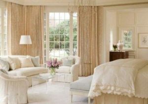
Perhaps it is the many years I worked outside our home, but to me, home means peace and refuge. A place of calm and a shelter from the craziness of our world. Because color is key to establishing a mood, I chose a Sherwin Williams color – Paper Lantern. This color is very similar to the color in the photo below and creates a peaceful, calm mood. This color runs through our entire home with the exception of the bedrooms, kitchen and bathrooms. It is peaceful and creates a seamless flow in the home.
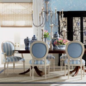
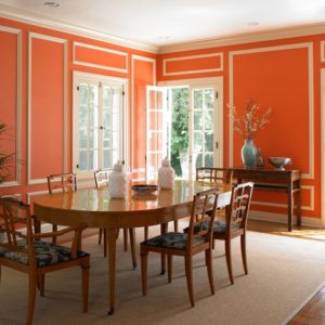
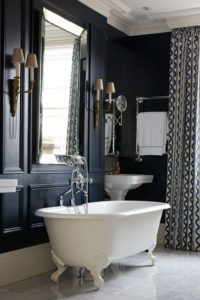
While I enjoy light and airy rooms, possibly you are happy in rooms with vibrant or deep colors, such as in the photos below.
 Whatever your taste may be, always consider the room size, other furnishings, and the type/color of flooring in the room. Also, a most important consideration, the amount of natural light in the room. For example: Here in North Central West Virginia we have many cloudy days, dark can become dreary and dreary affects our feelings. Therefore, a deep, dark wall color, is probably not a wise choice for a room without a good amount of natural light.
As you can see from this post, or maybe you already knew, there is a tremendous amount of information to consider with regard to color. Way too much for one blog post. So, for fear of boring you to death with color specifics, I will close for now. But before I do, I want to share some interesting information. It may offer an explanation as to why you are drawn to a certain color or colors.
Lovers of Red: If you are drawn to red , you are very self-confident. You are unafraid to take risks. You are passionate, dramatic and dynamic.
Lovers of Pink: If you are drawn to pink, you are soft, romantic and refined. You are upset by violence of any kind. You are talented but not overambitious.
Lovers of Yellow: A preference for yellow is a preference for sunshine. Yellow people are original, imaginative, idealistic, creative, artistic, highly intuitive, and often spiritual.
Lovers of Orange: If you are drawn to orange, you work and play hard, are adventurous and enthusiastic. You have strong determination.
Lovers of Blue: If you are drawn to blue, you are calm, trusting, confident and are sensitive to the needs of others.
Lovers of Green: If you are drawn to green, you are intelligent and understand new concepts. You are a caring companion, loyal friend, partner, with a high moral sense.
Lovers of Purple: If you are drawn to purple, you are generous, charming, super sensitive, keenly observant and can be moody.
Lovers of Brown: If you are drawn to brown, you love simplicity, comfort, quality, harmony, hearth, and home. You have firm strong views.
Lovers of Gray: If you are drawn to gray, you are practical and calm and do not like to attract attention. You crave contentment.
Lovers of White: If you are drawn to white, you are neat and immaculate in your clothing and in your home. You are a cautious buyer, you are sincere and kind.
Thanks for visiting. Wishing you and yours a beautiful week !
Au Revoir,
Sandra
Note: The color-personality reference is from an interior design course I completed in 2014.
Photos: Ethan Allen, Dunn-Edwards Paint,House&Garden-uk/ All photos/Pinterest
I’ve used every color of the rainbow in 46 yrs….so for the moment a soft blue gray is my favorite.
Cindy: I love that color tone as well. So calm and peaceful and works well with many other colors.
Thanks for visiting – have a great week!
Samdra, I always enjoy your perspective on decorating! I have always loved color and thrive with a certain color running through my public rooms. I don’t shy away from color, but I do understand people’s need for neutrals that provide serenity and calm! Thanks so much for sharing! Have a wonderful Tuesday!
Pam: Thanks for visiting. I, too, love color. However, to live with it on a daily basis I prefer calm, with color is accessories. I have friends, who like you, feel alive when they live with certain colors. The beauty is: There is something out there for all of us!
Happy summer days and again, thanks for stopping by!
I love colour. It makes my eyes and soul happy. I’ve been drawn to probably most of the colours at some point in my life. Blue and white combo always stays a current top favourite.
A lovely post …
Thanks for visiting, Bren. I also love to see pops of color and like you I am partial to blue and white. Just something about it that is so appealing to me!
Enjoy these summer days – we will blink and it will be Christmas !
Great post..I love color, especially blue and yellow!
Shirley: Thanks for visiting and I am happy you enjoyed the post. I am with you about the blue and yellow – it is hard to beat and is so cheerful.
Hope this finds you enjoying summer days !